Bukett
2024
︎ Concept development
︎ Art direction + design
︎ Brand guide development
︎ Photography
2024
︎ Concept development
︎ Art direction + design
︎ Brand guide development
︎ Photography
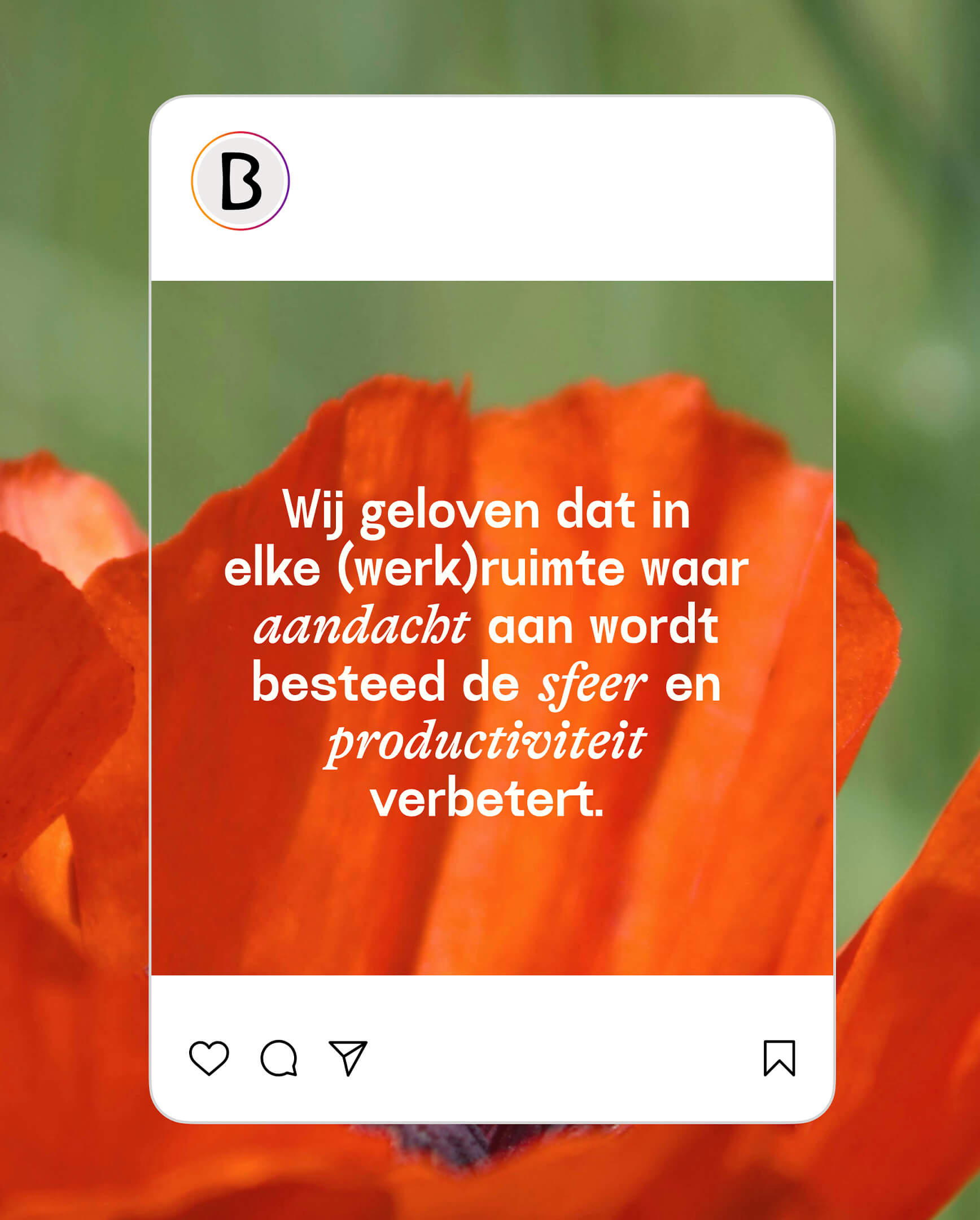
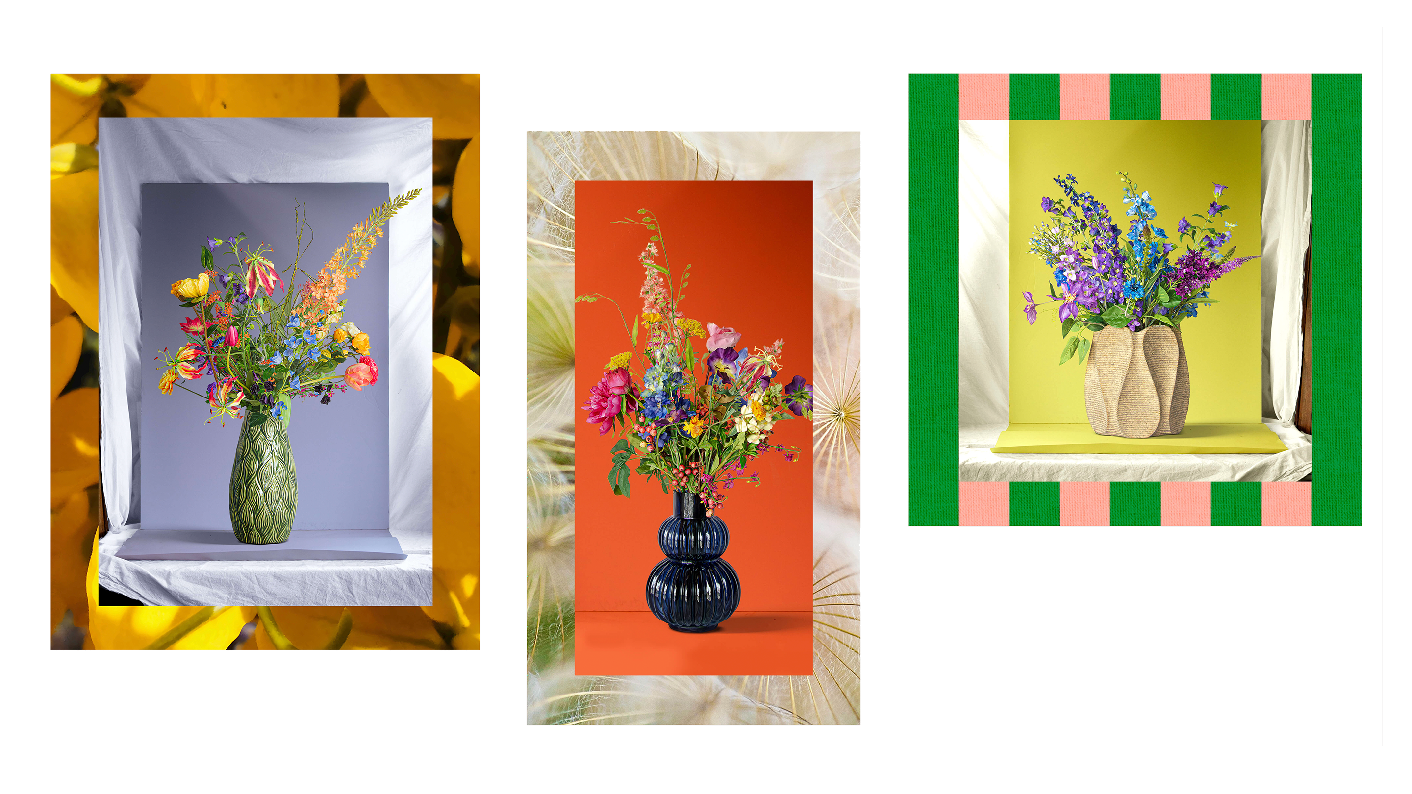
2024 started in full throttle creating the brand identity for Bukett, an Amsterdam startup focussing on faux-bouquet rental services for offices.
One of the biggest requests from the client was to stay away from all the clean, Scandi chic brands already out there — instead, contemporary, eclectic, and bold were our key words.
I wore many different hats for this one: strategist, copywriter, copy, concepter, art director, design director, photographer, DTP-er, webdesigner.
Sadly the CEO decided to keep their (other) day job after all, so Bukett is on hold for now — but don’t let that stop you from enjoying this fine piece of branding.


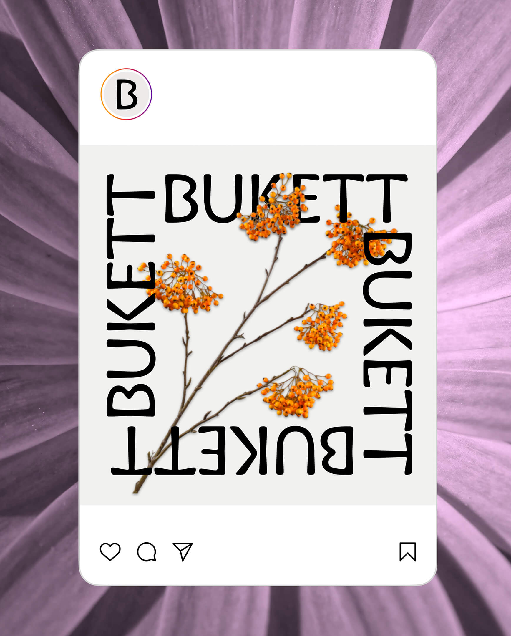
What I love about this identity is that it’s very outspoken and definitely different, yet very simple in it’s system setup.
Yes, the brand system has rules (otherwise it wouldn’t be a brand system heh?), but I made sure it was going to be easy to apply, as I knew from the get go that the client wouldn’t have a big budget to keep on a designer or even DTP-er from the launch of the product. So there’s rules around border sizes, typography, photography and the use of colour, but the implementation is simple and can be done by the managing director herself.
Yes, the brand system has rules (otherwise it wouldn’t be a brand system heh?), but I made sure it was going to be easy to apply, as I knew from the get go that the client wouldn’t have a big budget to keep on a designer or even DTP-er from the launch of the product. So there’s rules around border sizes, typography, photography and the use of colour, but the implementation is simple and can be done by the managing director herself.